

📊 Executive Dashboard
The Executive Dashboard is the first screen that the principal or administrator sees when logging into the SGA. It presents a complete summary of the institution's status: enrollment, attendance, finances, incidents, and trends over the last 30 days.
👤 Primary profile: Principal / General Administration
Access: Side menu → Dashboard → Main (also the system's home screen)
1. Key Performance Indicators (KPIs)
Upon entering, 8 cards are presented with the school's most important indicators, organized in two rows.
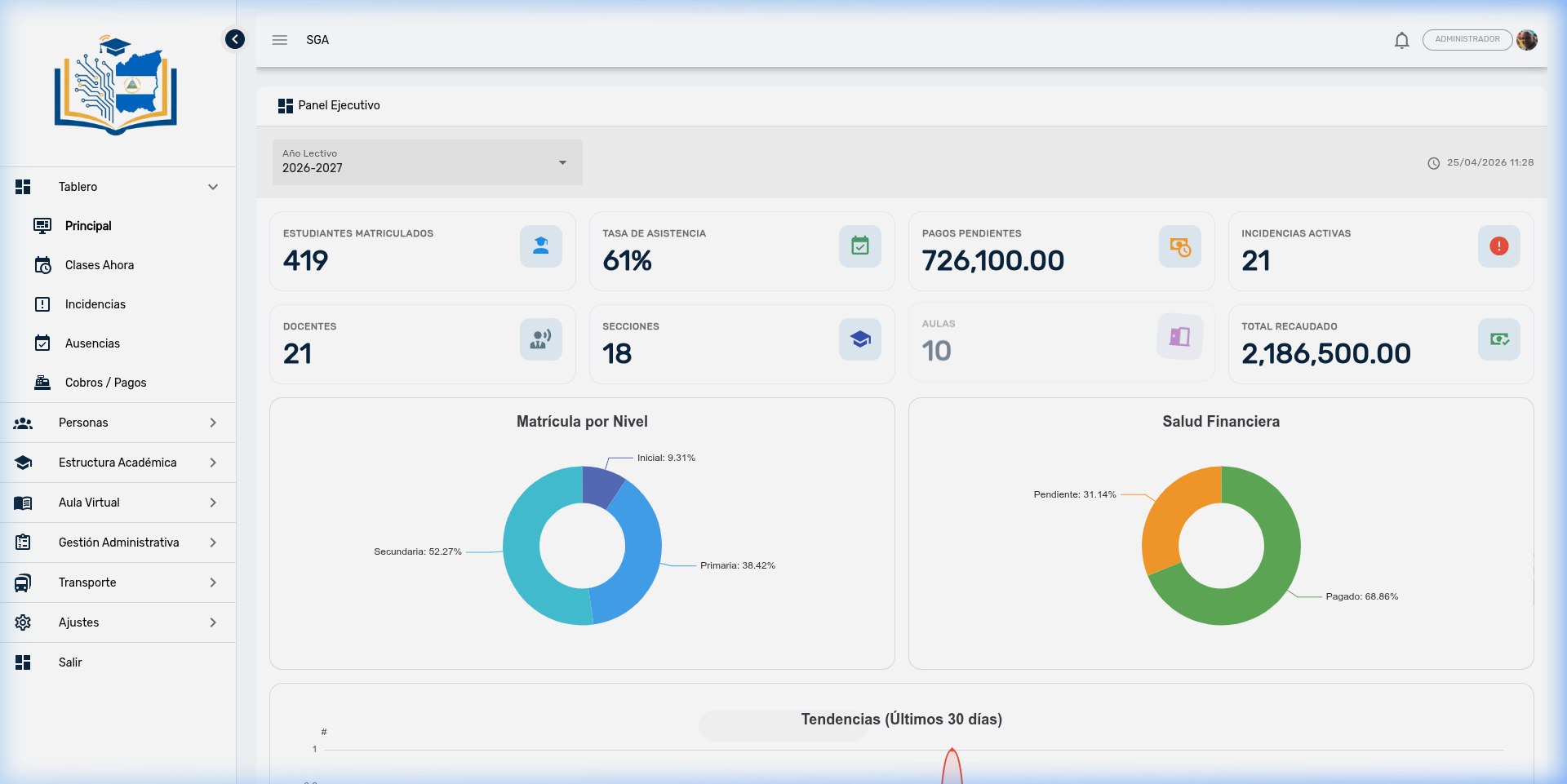
Main row — Critical indicators
These four indicators reflect the daily pulse of the institution:
| Indicator | Icon | Color | What it measures | Example |
|---|---|---|---|---|
| Enrolled Students | 🎓 | 🔵 Blue | Total active students in the selected school year | 419 |
| Attendance Rate | ✅ | 🟢 Green | Overall average attendance percentage for the school | 61% |
| Pending Payments | 💰 | 🟠 Orange | Total amount in córdobas of unpaid charges | C$ 726,100.00 |
| Active Incidents | ⚠️ | 🔴 Red | Number of unresolved disciplinary incidents | 21 |
Secondary row — Operational indicators
These indicators show the school's operational structure:
| Indicator | Icon | Color | What it measures | Example |
|---|---|---|---|---|
| Teachers | 👨🏫 | Blue-gray | Total teachers registered in the system | 21 |
| Sections | 🏫 | Indigo | Active academic groups or sections | 18 |
| Classrooms | 🚪 | Purple | Available classrooms | 10 |
| Total Collected | 💵 | 🟢 Green | Sum of all payments effectively received | C$ 2,186,500.00 |
How to Use KPIs
Compare indicators regularly: if the attendance rate drops while active incidents rise, it may signal a coexistence problem that needs immediate attention. If pending payments grow, coordinate with the cashier to intensify collection efforts.
School Year Selector
In the upper left corner, a school year selector appears that allows switching between academic periods. All indicators and charts are automatically recalculated when changing the year, enabling historical data comparison (e.g., 2025 enrollment vs. 2026).
2. Distribution Charts
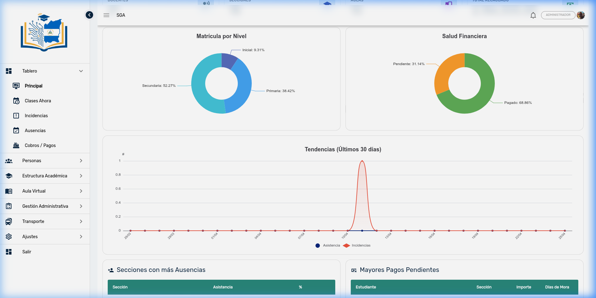
The panel includes two donut charts showing enrollment composition and financial status.
Enrollment by Level
Shows the percentage distribution of students by educational level:
| Level | Percentage | Students | Color |
|---|---|---|---|
| Early Education | 9.31% | 39 | Indigo |
| Primary | 38.42% | 161 | Blue |
| Secondary | 52.27% | 219 | Turquoise |
Reading the Chart
A marked imbalance may indicate opportunities: if Early Education is very low, preschool recruitment can be strengthened. If Secondary concentrates more than 50%, verify that the teaching staff and spaces are sufficient for that level.
Financial Health
Shows the proportion between payments made and accounts receivable:
| Status | Percentage | Amount | Color |
|---|---|---|---|
| Paid | 68.86% | C$ 2,186,500 | 🟢 Green |
| Pending | 31.14% | C$ 726,100 | 🟠 Orange |
| Overdue | — | — | 🔴 Red (if applicable) |
Financial Interpretation
A collection rate above 70% indicates solid billing management. If the pending percentage exceeds 40%, consider activating mass reminders via push notifications or WhatsApp, or reviewing current payment arrangements.
3. Trends Over the Last 30 Days
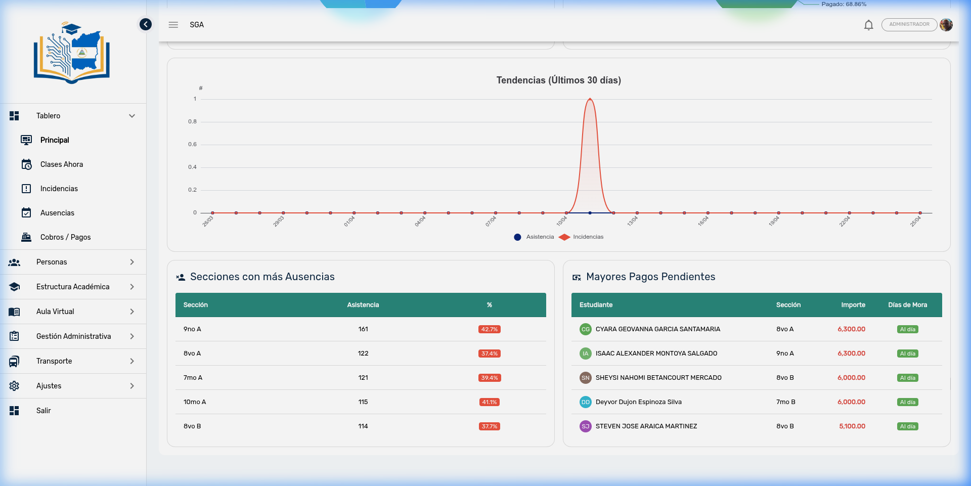
This line chart shows the daily evolution of two key variables over the last month:
| Line | Color | What it shows |
|---|---|---|
| Absences | 🔵 Navy blue | Number of non-attendance records per day |
| Incidents | 🔴 Red | Number of disciplinary incidents per day |
How to Read It?
- Simultaneous peaks (absences and incidents rise together): May indicate a coexistence issue or an external event affecting the student body
- Weekly cyclical pattern: It is normal to see more absences on Mondays and Fridays — useful for scheduling evaluations on higher attendance days
- Sustained upward trend: An alert signal requiring intervention (parent meetings, disciplinary reinforcement)
- Abrupt drops: May coincide with evaluation periods (students attend more) or holidays
4. Sections with Highest Absenteeism
Below the trends chart, a table appears with the 5 sections with the most non-attendance records:
| Column | Description |
|---|---|
| Section | Group name (e.g., 7th A, 4th B) |
| Absences | Total non-attendance records |
| Percentage | Section absenteeism rate |
The percentage is displayed with a colored badge based on severity:
| Badge Color | Meaning |
|---|---|
| 🟢 Green | Less than 10% — acceptable level |
| 🟠 Orange | Between 10% and 20% — requires attention |
| 🔴 Red | Over 20% — critical level, requires intervention |
Recommended Action
If a section appears in red, coordinate with the homeroom teacher to identify the causes: are the same students always absent? Is there a day pattern? Consider calling in the parents of students with the highest absenteeism.
5. Students with Highest Debt
The second table shows the 5 students with the highest outstanding payment amount:
| Column | Description |
|---|---|
| Student | Name with photo or initials |
| Section | Student's grade and group |
| Outstanding Amount | Total balance owed (in red, C$ format) |
| Days Past Due | Days elapsed since the due date |
Days past due are displayed with a colored badge:
| Badge Color | Meaning |
|---|---|
| 🟢 Green ("Current") | No overdue balance — the payment is not yet due |
| 🟠 Orange | Between 1 and 30 days past due |
| 🔴 Red | More than 30 days past due |
Collection Management
Students with more than 30 days past due in red should be prioritized in collection efforts. You can send push notifications from the Notifications module or coordinate direct WhatsApp contact with the guardian.
6. Decision-Making Guide
The Executive Dashboard is not just informational — it is designed to facilitate strategic decision-making:
| Situation Observed | Suggested Action |
|---|---|
| Attendance rate below 70% | Review the Absence Panel to identify problematic sections and grades |
| Active incidents on the rise | Check the Incidents Panel to analyze distribution by level and trends |
| Pending payments exceeding 40% | Coordinate with the cashier for mass reminder generation and payment arrangement review |
| Section in red for absenteeism | Meeting with homeroom teacher and parent call-in for repeat offenders |
| Student with more than 60 days past due | Evaluate report card blocking and direct contact with the guardian |
Frequently Asked Questions — Administration
| Question | Answer |
|---|---|
| Is the data in real time? | Data is loaded when entering the panel and updates every time the school year is changed. To see recent changes, reload the page. |
| Can I view data from previous years? | Yes. Use the School Year selector to compare indicators across different periods. |
| What does "Attendance Rate 61%" mean? | That of all attendance records taken, 61% correspond to "Present" status. This includes all grades and sections of the school. |
| Do financial amounts include all currencies? | Amounts are displayed in córdobas (C$). If the school handles charges in dollars, they are shown separately. |
| Can I export the dashboard data? | Currently no. For exportable reports, use the individual modules (Billing → Export Excel, Attendance → Export, etc.). |
| Who can see the Executive Dashboard? | Users with schedule query permissions. Generally: principals, vice-principals, and authorized administrative staff. |